Aug 17, 2015
RainRain
Comments Closed
Business, Design, PR
business, Design, PR

This article may be inspiring for some companies. Of course feel free to get in contact if you need any help 😉
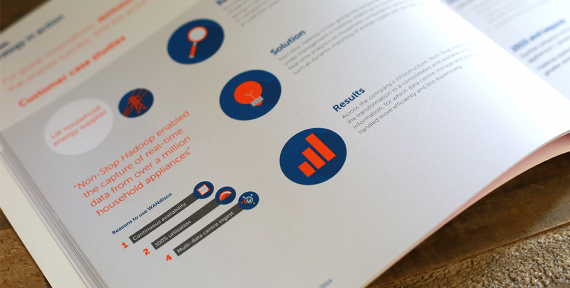
The usual company annual report is a word-filled extravaganza of jargon, terms, figures and text. If beautiful report designs were the norm, maybe more people would actually read them.
Source: 20 Annual Report Designs that Crush the Stereotype – Hongkiat
Cover Image: Warren Harper
Comments RSS Feed
